Famous Brand Logos in Microsoft Style
Microsoft needs no introduction. Even the layman would be aware of this term and must have heard it once in his life. There are very few path breaking concepts and companies which world has witnessed and Microsoft is amongst them undeniably. There are many discussions held earlier on the topic of Microsoft’s logo by different philosophers, designers, business entrepreneurs and many others. They were critical yet pointing so many questions over the company related to their logo. It is strange that the logo of the company remained unique, intriguing and attractive. Apart from so many doubts by others the logo created its way to the heart of the consumers and customers. The logo is undoubtedly a great example of minimalistic logo.
| After 25 years Microsoft changed, in a way altered its logo and came up with a modified one. But again, the same logo is just a mere modification of the original idea and not a 360 degree change. This is how a modified logo should be. |
 |
| I was just wondering, how would it be like to see different and popular brands adopting the logo designing techniques of Microsoft? For instance, consider Starbucks, Pepsi, Firefox, Apple and Google etc following the same footsteps as of Microsoft in order to redesign their logos! It will be both interesting and fun. |
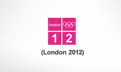
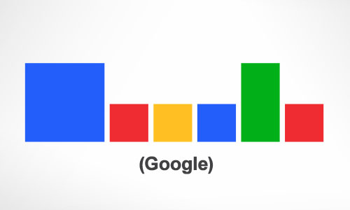
| Following are some examples of the famous and reputed brands which are designed according to the Microsoft style. These logos look simple, attractive and appealing as well. They say a lot of things which audience will surely like. Share your comments and views related to which logo(s) according to you is best suitable for the particular brand: |
Starbucks |
 |
Apple |
 |
Firefox |
 |
Pepsi |
 |
|
|
 |
London Olympics |
 |
|
|
 |
| Source: logoblog.org |


